HTML5 has become the new standard for digital ads, and as a result, we now have the ability to produce and traffic ad creatives across devices – mobile, tablet and desktop. But should we?
There has been much debate lately about what ‘responsive’ really means. Responsive design, first defined by Ethan Marcotte from A List Apart, means creating experiences that respond to the needs of users and devices.
Marcotte goes on to say that we shouldn’t be “quarantining our content into disparate, device-specific experiences” but designing a single experience that performs flawlessly across devices. While this might work for some, we don’t believe you can provide a truly kick ass user experience when you have to generalize your content. As those who’ve scrolled themselves to death trying to navigate around a responsive site know, it doesn’t always work.
Of course, if you have a slew of designers, engineers, techs and gobs of time and money, it’s doable. Unlike websites, most of us in the ad tech world are lucky if we have a couple days (or hours!) to produce, traffic and deliver a digital ad campaign.
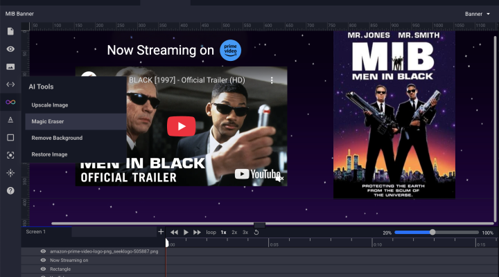
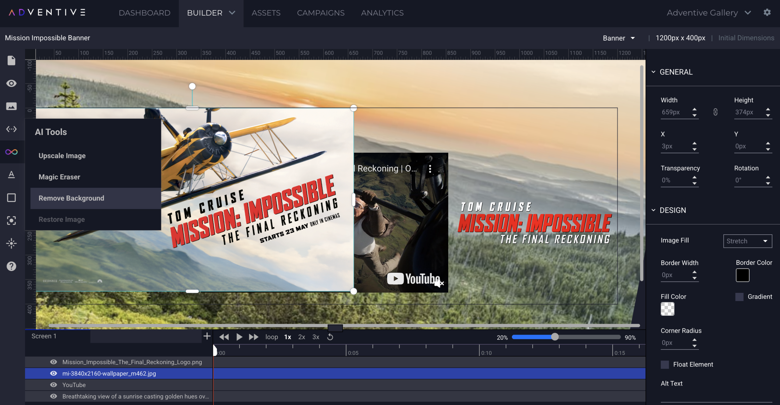
Our approach to responsive ads is different, allowing you to build unique mobile, tablet and desktop experiences and traffic them with a single ad tag. Depending on browser size, Adventive automatically delivers the appropriate ad unit. Something we call Responsive Delivery Groups.
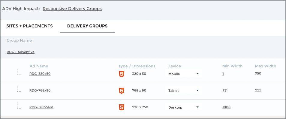
Responsive Delivery Groups allow you to build truly customized experiences for mobile, tablet and desktop devices. You can also set custom breakpoints and, as with all ads built with Adventive, update creative in real time – without re-trafficking.
Check out a demo here. Just resize your browser (on desktop of course) window. Consider your socks knocked off.